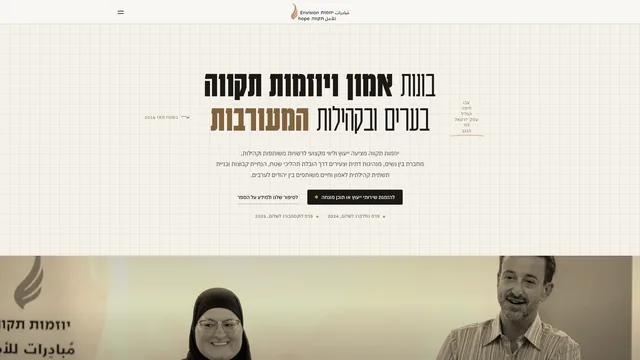
CLIENT · 2026
THE FIRST 8 SECONDS, RECORDED FROM THE LIVE SHOWCASE
Hope Initiatives
- CATEGORY
- Nonprofit
- SERVICES
- Design, Dev, Motion, CMS
- TYPE
- Client work
- SCOPE
- 8 pages in 3 languages
- YEAR
- 2026
- LIVE SITE
- View the showcase
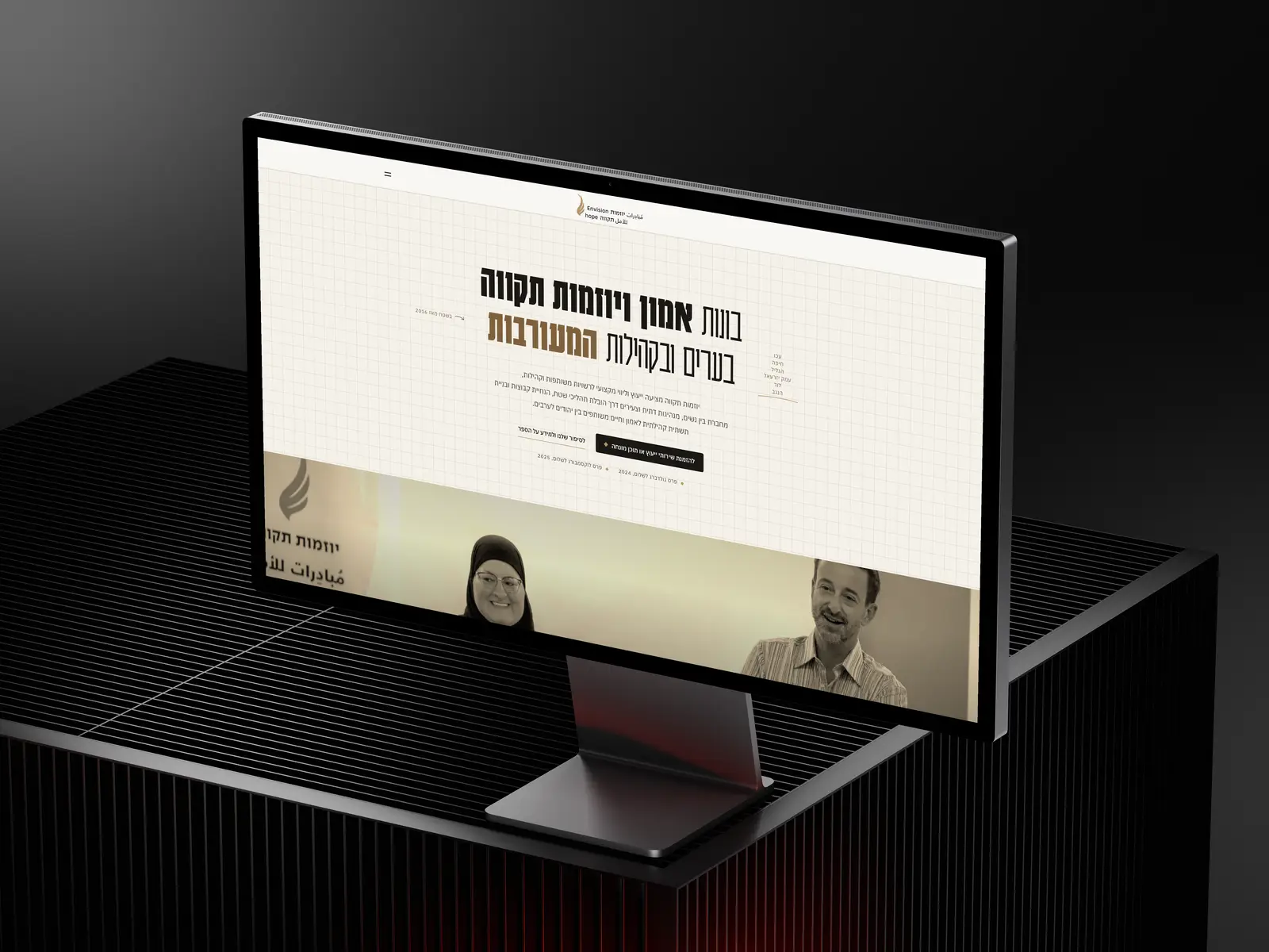
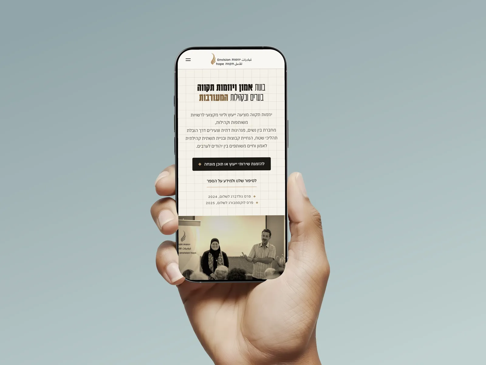
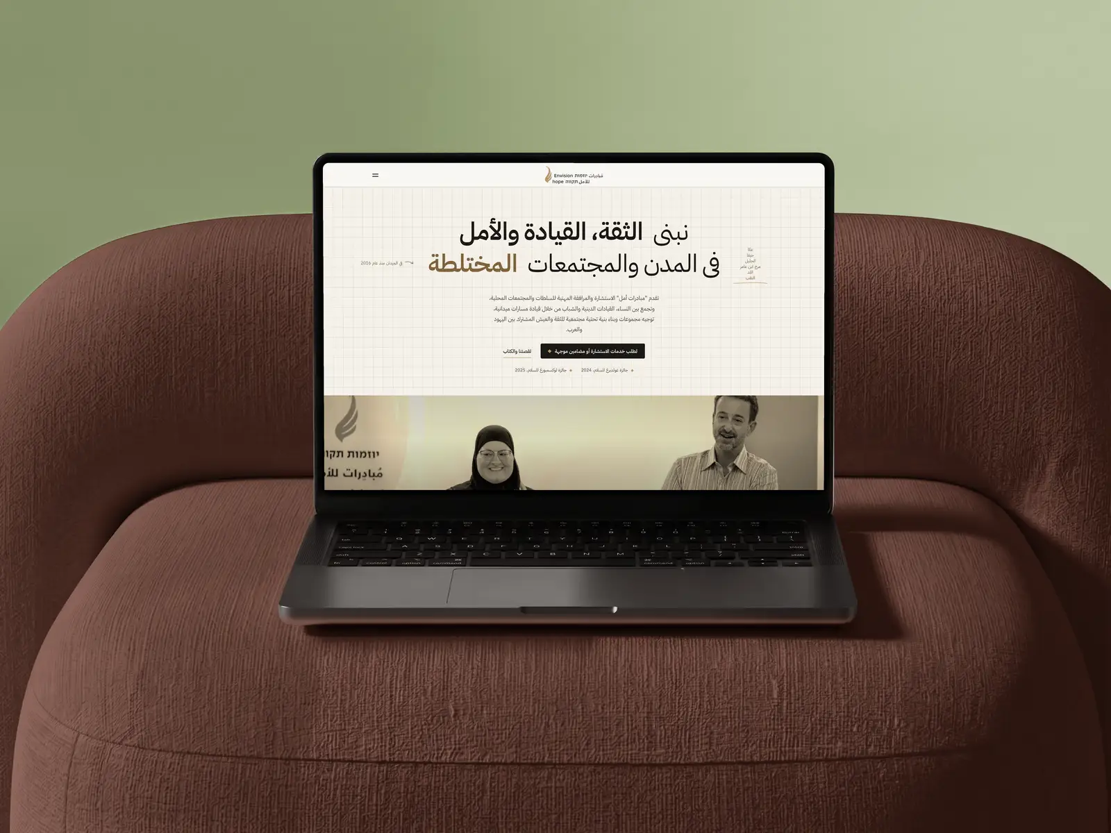
A website in Hebrew, Arabic and English for a Jewish-Arab partnership.
Hope Initiatives (יוזמות תקווה) is a nonprofit led by Ghadir Hani and Dror Rubin. They work on trust between Jews and Arabs in Lod, Acre and the Galilee, with consulting for mixed-city authorities, social tours, education and women's leadership. I designed and built their new site, eight pages in each of the three languages, with a CMS they edit themselves.
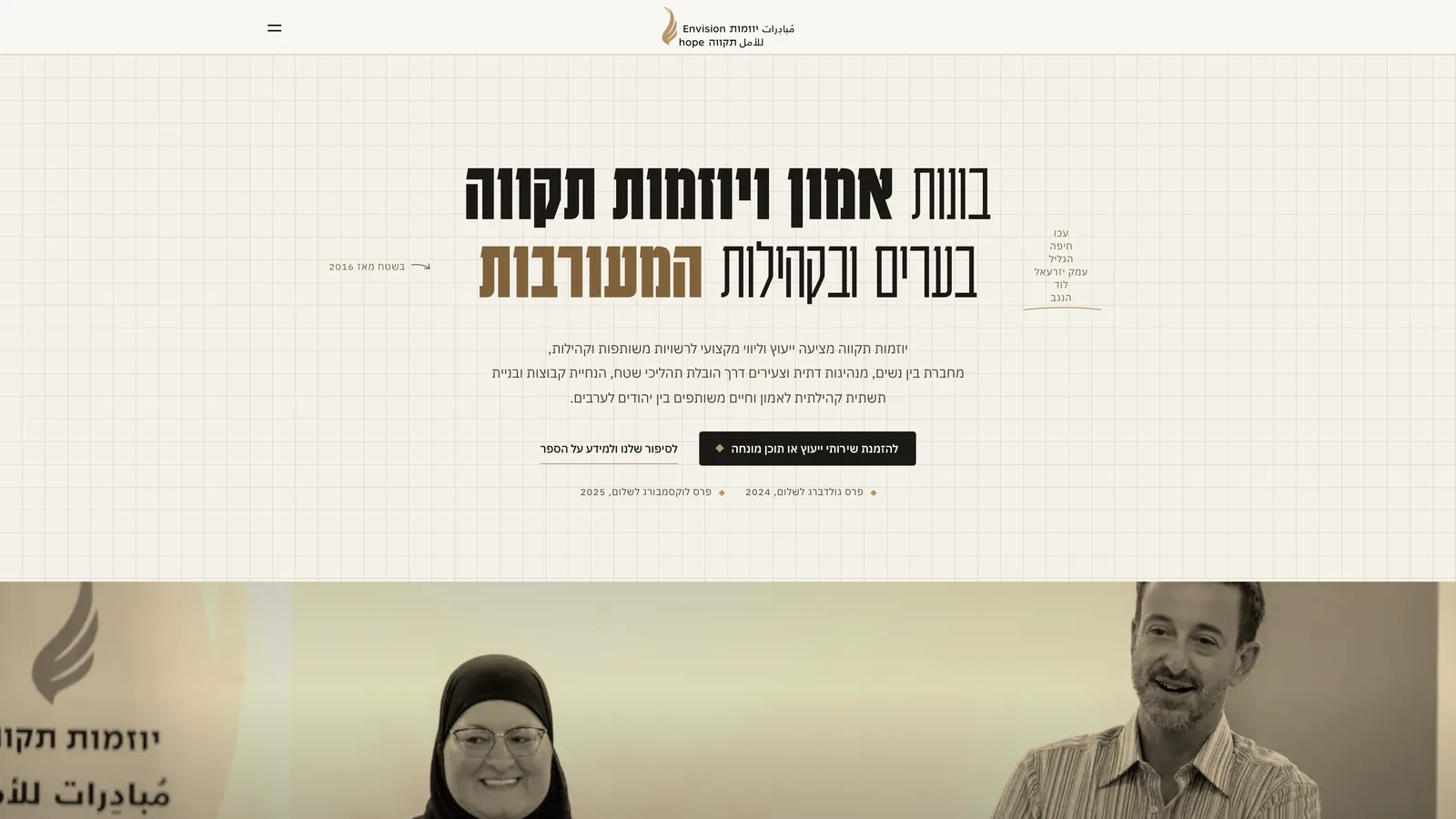
This page shows my first design. After the first review round the client chose a quieter version for their own launch, with colour photos, a drifting strip of pictures and no loader. I kept the first design running as a showcase, on the same content and the same code.
THE PROBLEM
The work was hiding behind a book.
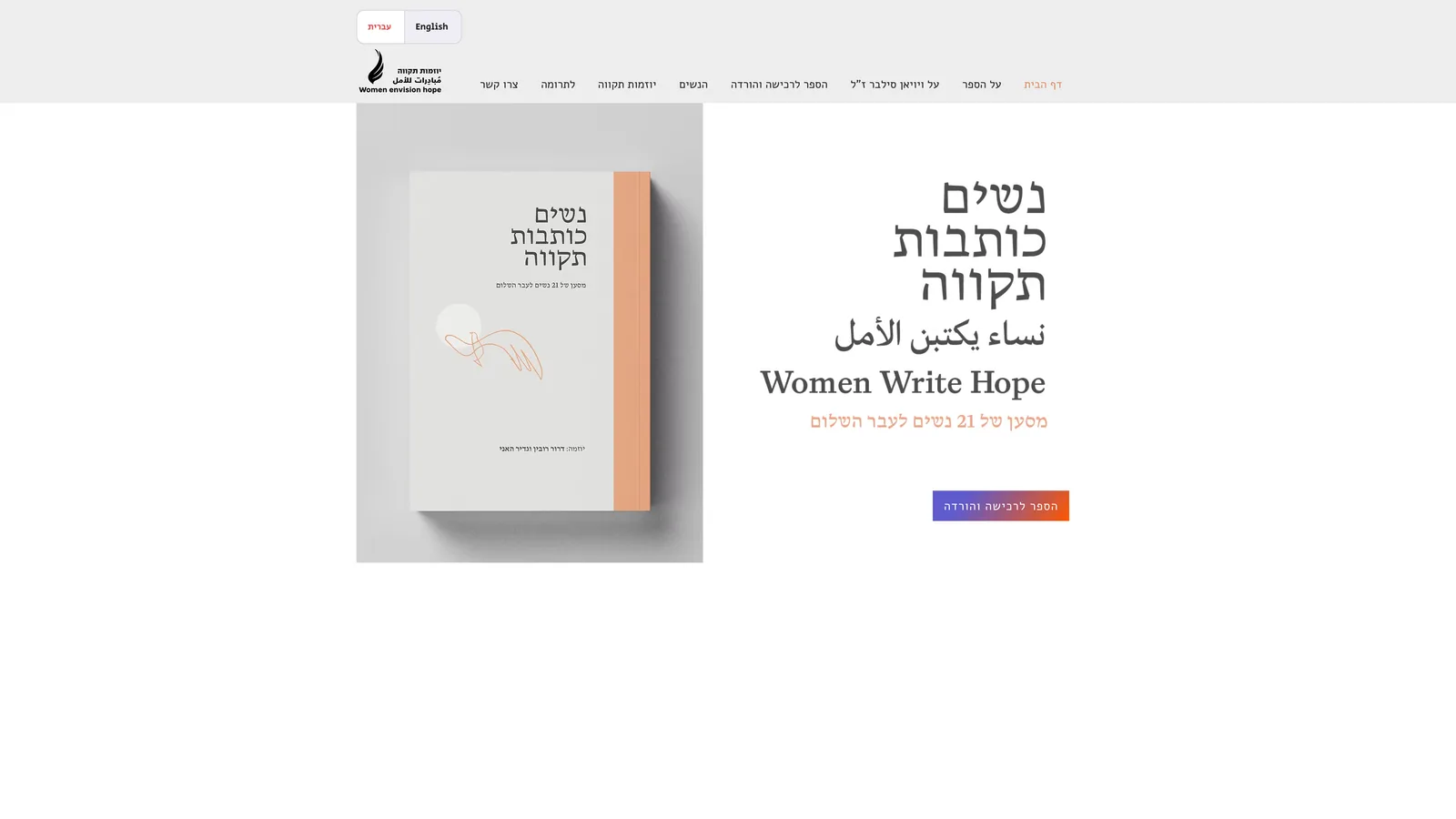
Their old site was a Wix page for Women Write Hope, a book by twenty-one women. The consulting, the tours and the education programmes sat behind one menu item, and the language switch offered Hebrew and English only. Arabic appeared once, in the book's title, on the site of a Jewish-Arab partnership.
The new home page says what they do in the first screen, in all three languages, with the two people who lead it in the first photograph.
THE APPROACH
Where the motion goes.
The site is a poster: cream paper, a 30px grid, a condensed headline and one warm band of photograph. The motion is there to open that poster up as you read.
01
The name first
The logo opens large and alone on the cream, then travels into its own place in the bar in one move. The half second it sits there before the page arrives is the whole loader, so there's no curtain to clear away. If anything stalls, the page shows itself after 4.5 seconds anyway.
02
The photograph opens
At the fold the photograph is a low band, which is the poster's composition. Below the fold that crop cuts Ghadir and Dror off at the forehead, so the first time you scroll to it, the band grows to the photograph's own proportions and stays open.
It never opens on load. The first build did, and the first thing a visitor saw was the ceiling of a meeting room.
03
The film grows as you scroll
Their film starts as a small plate beside the statement and grows into a full-width band as you scroll past. It's one video element the whole way, moved between two places with GSAP's Flip, so nothing crossfades and nothing loads twice.
04
Three languages, two directions
Hebrew sits at the root, with Arabic and English beside it, and two of the three read right to left. Every motion on the site runs in reading order, so the programme tabs sway the way your eye moved and the statement's gold wave runs right to left in Hebrew.
Arabic letters join, and splitting them into characters for that wave breaks the words, so in Arabic the statement is plain. The Arabic copy comes from the client's team, never from a machine translation.
STYLE GUIDE
A poster on a 30px grid.
Seven colours, two type families for three scripts, five durations, and the grid under all of it. Gold is the one accent, and it has a rule of its own, because the brand's gold is too light to read on cream.
THE MARK
THE CLIENT'S OWN, ALWAYS WHOLE
The logo comes from their designer, with the name in all three languages in one lockup. The bar always shows the whole thing, and the loader is built around it.
Paper
#F5F1E9
PAGE
Plate
#F8F6F2
THE BAR, CARDS
Deep
#EDE7DA
PANELS
Ink
#1B1815
TYPE, THE FOOTER
Annotation
#796A56
SMALL TEXT
Gold
#B7966C
SHAPES AND MARKS
Gold deep
#80623D
GOLD TEXT
15.7 : 1
INK ON PAPER
AAA
5.0 : 1
GOLD DEEP ON PAPER
AA
2.5 : 1
BRAND GOLD ON PAPER
SHAPES ONLY
The brand's gold reads at 2.5 to 1 on the cream, under the 3 to 1 even big headlines need. So it only draws shapes, the flame and the markers, and every gold word on the site is set in the deeper gold, at 5 to 1.
ONE FILTER, EVERY PHOTO
GRAYSCALE(1) SEPIA(.42) SATURATE(1.45) CONTRAST(1.1)
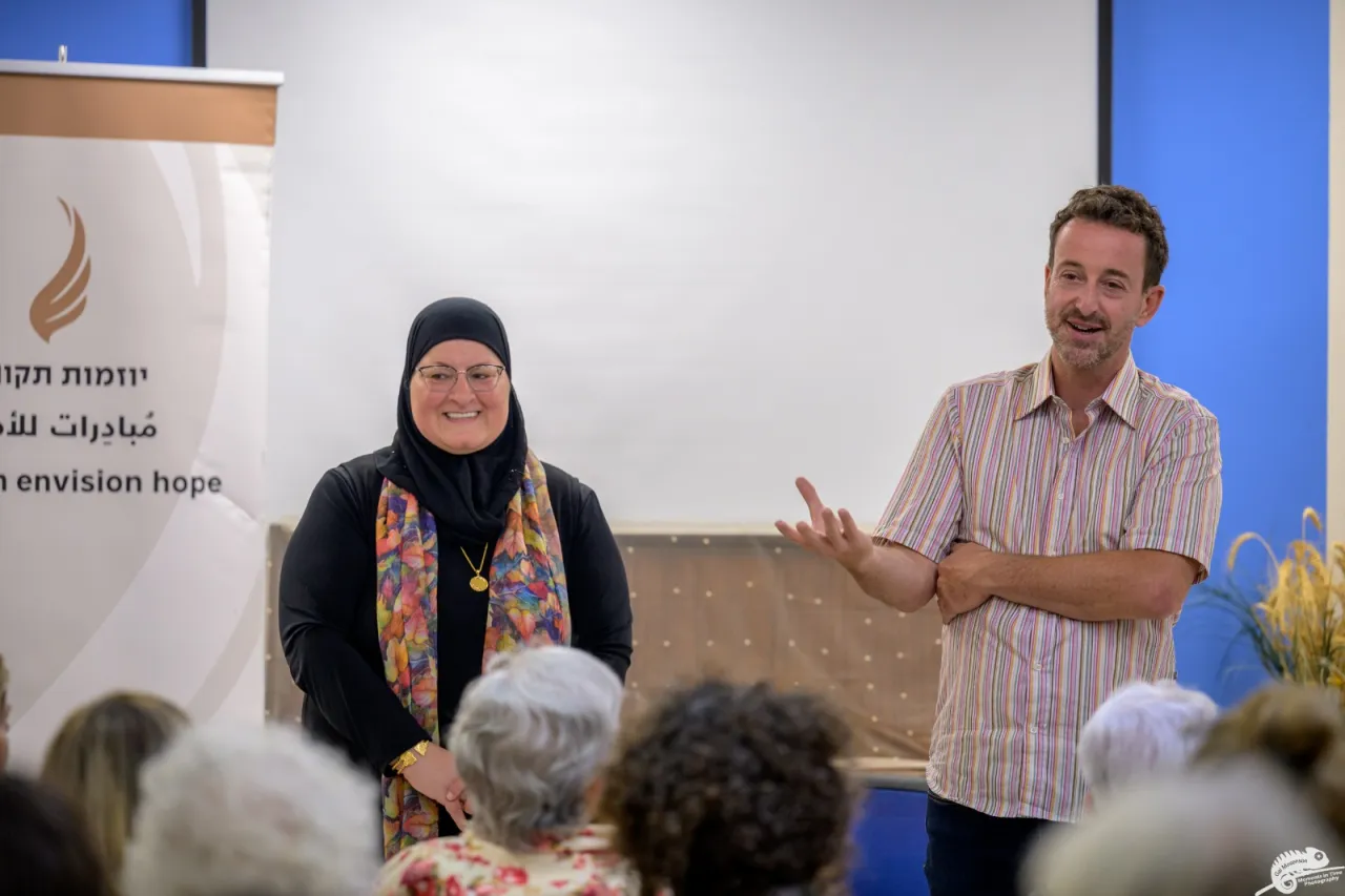
The photos come from the client's own archive, from different events and different cameras. One CSS filter on every picture turns them into a set in the paper's colours, and there's no per-photo editing, so a photo the client uploads tomorrow matches on its own.
DISPLAY
KARANTINA 300 + 700 · PLEX ARABIC 600
בונות אמון ויוזמות תקווה
نبني الثقة، القيادة والأمل
Building trust, envisioning hope
Karantina is a condensed Hebrew poster face with Latin, set light and bold inside one headline. It has no Arabic, so Arabic falls through to IBM Plex Sans Arabic, from the same family as the text face.
TEXT
IBM PLEX SANS HEBREW 400
ייעוץ לרשויות משותפות, סיורים חברתיים, חינוך ומנהיגות נשים.
Each script is its own font file, and a browser downloads only the ones a page's text uses.
MOTION
GOLD APPEARS IN MOTION ONCE
Out of the field, out of the pain and the hope of shared life in mixed cities, grew a deep partnership.
DURATIONS, SECONDS
The statement above is the site's one gold moment: each letter passes through gold on its way to ink as you scroll.
EXPO.OUT
Pages and the loader arriving.
DRAWN FROM GSAP'S EXPO.OUT
POWER4.OUT
Every scroll reveal.
DRAWN FROM GSAP'S POWER4.OUT
UNDER THE HOOD
- STACK
- Astro, static HTML
- CONTENT
- Sanity, one document per language
- MOTION
- GSAP, self-hosted
- FONTS
- Karantina + IBM Plex Sans Hebrew and Arabic, split by script
- HOSTING
- Cloudflare Pages
How fast it loads.
Measured on the live showcase's Hebrew home page. On a throttled phone it scored between 85 and 98 over five runs, four of them 97 or 98, and the largest paint landed at about 2.2 seconds.
- Every word and photo lives in the CMS, one document per language, and a publish there rebuilds the site.
- A language with a blank field shows the Hebrew words there, never an empty gap.
- With reduced motion turned on, you get the finished page with no loader, the film already wide and the photograph already open.
- The showcase is kept out of search on purpose, which is the only thing Lighthouse marks it down for.
WHAT SHIPPED
- THE SITE
- Home, about, five programme pages and a media page, each in Hebrew, Arabic and English, plus the legal pages.
- THE CMS
- A Sanity Studio in its own organisation, ready to hand to the client, that opens straight into each page in each language.
- THIS VERSION
- The first design on today's content, kept live as a showcase and out of search.
CREDITS
- DESIGN AND BUILD
- Ido Vadavker: design, development, motion, CMS
- WORDS AND PHOTOS
- Hope Initiatives
- LOGO
- Hope Initiatives' designer
- MOTION PARTS
- Flip scale, gradient wave text and bouncy tabs built on Osmo Supply resources
- TYPE
- Karantina and IBM Plex Sans Hebrew and Arabic, SIL Open Font License
NEED A SITE IN MORE THAN ONE LANGUAGE?
Let's build something worth showing.