Most websites funnel every call-to-action to the same destination. “Let’s talk.” Everywhere. Always the same contact page.
That’s not a design choice. It’s a default that nobody questioned.
Where someone is on the page tells you where they are in their head.
Someone clicking a CTA in your hero section has just arrived. They’re orienting. Sending them straight to a contact form is like asking someone to marry you before you’ve introduced yourself.
Someone clicking after reading your pricing has already done the math. They’re in a completely different psychological state.
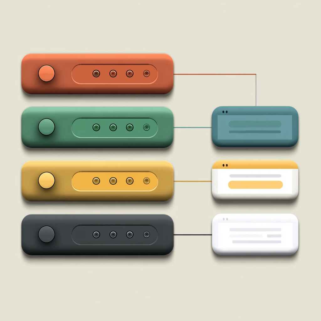
Simply changing button labels doesn’t solve this. Users respond to interaction shapes, not copy. A modal triggered from different buttons is the same experience regardless of what it says.
How I audited my own site
I found six CTAs routing to one modal. The fix was creating five distinct destinations:
- Hero → Anchor scroll down to pricing (they’re orienting, not committing)
- Pricing tier → Modal with a short form (they’ve done the math, meet them there)
- FAQ section → Jump link to the relevant question they probably have
- Footer → Contact modal (full consideration achieved, now they’re ready)
The audit framework
- List every CTA on your site
- Note what the visitor knows at that point — what have they read, seen, scrolled past?
- Identify the mismatch between the ask and where they are mentally
- Fix hero and post-pricing first — highest traffic, biggest gap
The goal isn’t to have fewer CTAs. It’s to have CTAs that match the visitor’s readiness, not yours.